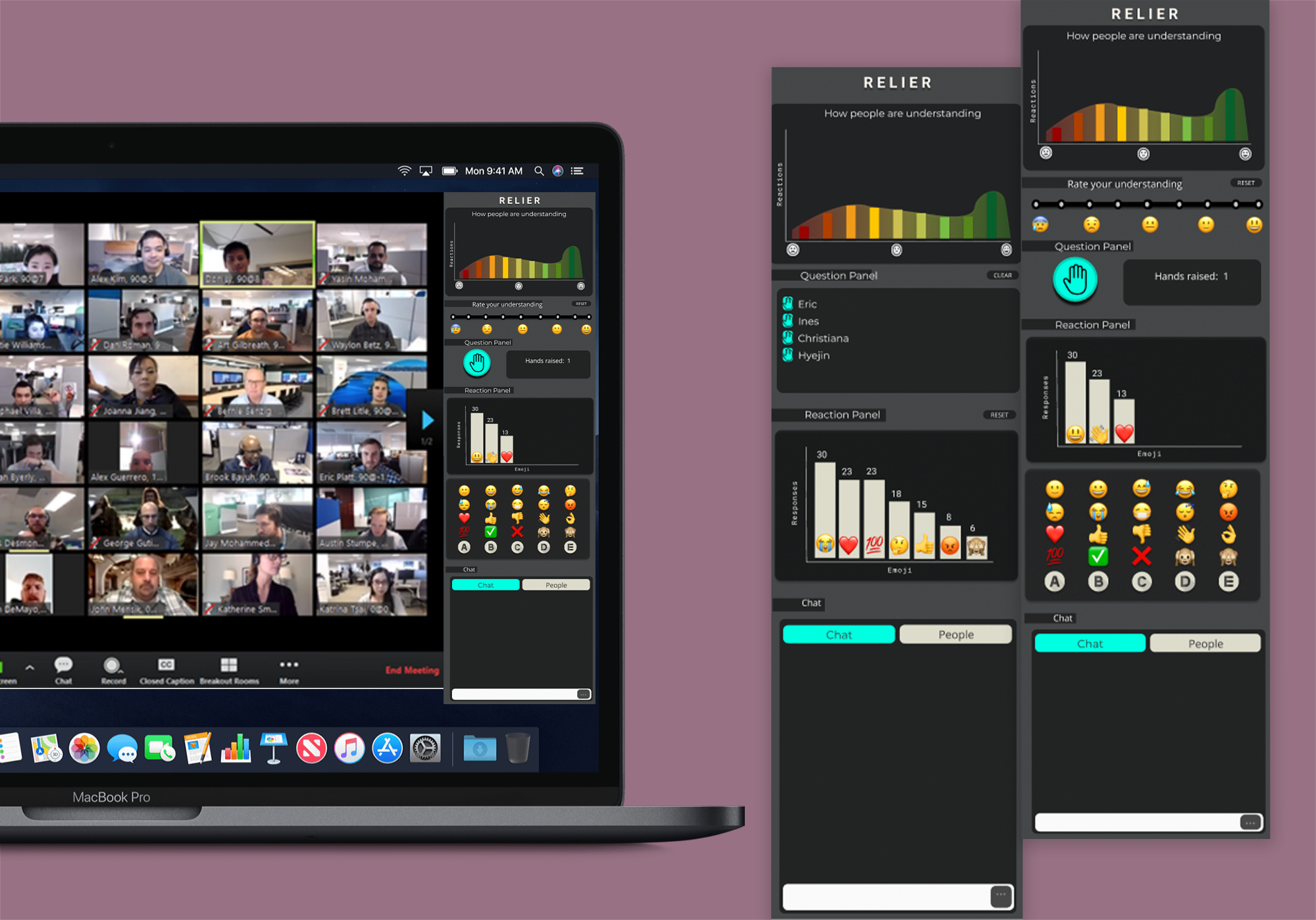
High-fidelity Prototype
1. User manuals and prototypes
For the Participants
For the Presenters
2. Design Evolution
Based on the feedback provided by the users through our tests on and by the new member of our team, we decided to make the following changes to our project’s design:
- Error and problem signalling to the host
- A feature that we did not consider for our project was signalling errors to the host, which was incorporated in the project of our newest team member. We have decided to include such a feature because it helps participants to easily notify their presenter that something isn’t working as expected and that it should be addressed immediately. Additional emojis will be included in the reaction’s panel to signal the host if they are muted or if their camera is off.
- A feature that we did not consider for our project was signalling errors to the host, which was incorporated in the project of our newest team member. We have decided to include such a feature because it helps participants to easily notify their presenter that something isn’t working as expected and that it should be addressed immediately. Additional emojis will be included in the reaction’s panel to signal the host if they are muted or if their camera is off.
- Clearer labellings
- Both of our testers had issues initially using and interpreting the ‘level of understanding’ graph as well as identifying where to react. To remedy this, we decided to add some more clear labellings of all the features. We added titles to each of the components of our app to make sure the user can identify clearly what is the purpose of each of them.
- Clear queue buttons
- Rationale: Our system is aimed to be used during presentations so it must not be overly disruptive or distracting to the presenter and/or participants. It should also provide support for students to express their emotional state in real-time with a variety of features without disrupting the presentation. If features are hard to access, users waste their time and can lose focus on the presentation.
-
Improving the ‘level of understanding’ graph
We had a lot of discussions around this feature as it is central to our project but caused quite a bit of confusion to our testers. Questions raised by our team members were:- How do we better display the data in order to avoid scenarios where the graph is ambiguous?
- We crucially had to determine how we were going to deal with lack of responses from participants. Originally, we envisioned the level of understanding returning to a bell curve distribution after a certain time interval, where all participants' responses would slowly gravitate back to the middle. One fatal problem with this approach was we lost the difference between participants being away from their computer versus participants truly having a “middle” level of understanding.
- To remedy this, we decided to have participants' responses reset to nothing, not the middle, after a 1 minute. This way, the graph is nonexistent when the app is first opened and grows overtime as participants report their level of understanding. The host is also able to clear the graph at any time to gain further clarity about where the participants are currently at.
- How often do we reset the participant’s cursor?
- The above solution we had raised its own design decisions, namely, if we are going to reset the participants’ level of understanding, how often would we reset it? For instance, sometimes, participant’s may forget to move their cursor back after the presenter has finished re-explaining something, and if the distribution doesn’t move, this can cause confusion for the presenter. To remedy this, we decided on a 1 minute lifespan for a participant response, where after a minute, their answer is removed from the aggregate and reset on their client.
- How often do we update the ‘level of understanding’ graph?
- One of the aims of our project is to provide participants and hosts with reactions close to real-time. Hence, we decided to update the graph every 10 seconds, to be able to see how the distribution is moving over time.
- How do we better display the data in order to avoid scenarios where the graph is ambiguous?
3. User Population
Relier’s user base will be primarily populated by presenters who seek more interaction with their audience during their online presentations as well as the participants of such presenter’s talk. Participants will be recruited according to the following criteria:
- 1) Must have experienced an online webinar/class/presentation
- 2) Must have engaged in an online webinar/class/presentation
However, more precisely, we will recruit participants who represent our different personas that could potentially interact with our system. We decided to apply the test plan on three of those:
- Diane, the presenter in an informal education community who has some experience with video conferencing software and cares about participation. For those presenters who care about participation and want to ensure their audience is following and understanding the content, Relier provides them with an outlet to convey all interactions. We decided to remove the tech-savvy presenter persona (i.e Dakota) from the tests because the only difference between these two personas is their level of knowledge and comfort with video conferencing softwares and technology in general and, if someone with less experience (i.e. Diane) finds our system easy to use, it is clear that it would also be the case for someone with more experience (like Dakota).
- Priscillia, the shy university student who is highly focused during presentations. For those participants who usually stay quiet during presentations and are too socially anxious to ask questions or interrupt the presenter if they are feeling lost, Relier provides a way of anonymously reacting and voting via the ‘level of understanding’ cursor and emoji reactions. This will likely propel such participants to be more active and express themselves (anonymously) during presentations.
- Jamie, the active business convention participant who is highly focused during presentations. For those participants who like to participate in conversations and engage with the presenter, Relier provides them with a way of doing so in a less disruptive way. With our system, their hand raised and signals to the presenter are more likely to be noticed and they would not lose their chance to speak.
4. Usability Goals
We decided to test four of our five usability goals: ease of use, efficiency, effectiveness and satisfaction. The reason why we decided not to test for learnability is because this would involve a much longer test as well as testing on second-time users. Here are the quantitative measures we used to evaluate each of the remaining goals:
Quantitative measurement:
- Time-on-Task
- Completion rate
- Error-free rate.
Users should be able to react in real-time and view trends with minimal disruptions to focus.
Quantitative measurement:
- Time on Task (TOT) of each task
Qualitative measurement:
- Subject’s raw reaction to the system through the observer’s data.
- Self-reported measurements through the post-test questionnaire about the efficiency of the system and its level of distraction.
The user should feel more comfortable to express themselves and feel more a part of the presentation
Qualitative measurement:
- Subject’s raw reaction to the system through the observer’s data.
- Self-reported measurements through the post-test questionnaire about whether the software helps increase engagement during video conferencing.
Qualitative measurement:
- Gather subject’s raw reaction to the system through the observer’s data.
- Self-reported measurements through the post-test questionnaire about their level of satisfaction with the system (likert-scale).
- Informal interview of the participant by the examiner to get feedback on the favorite features, what was distracting, etc.
5. Usability test procedure
Please view the attached User test plan. This is a very extensive document, for the sake of peer-reviewers, here is a summary of all questions addressed.
How many examiners are required?
At least two examiners are needed for this test, but three will be preferred. The examiners will be responsible for:
- Guiding the user through the test, giving them instructions and answering their questions.
- Observing the test and taking notes.
- Recording the test.
What equipment will the examiners need?
Examiners will need to have access to a web browser on a computer to access the prototype. They will also need to have a filming device to record the test and a timing device for time measurements. All documents for the test are available in our website.
How should the prototype be handled?
The prototype is to be handled in the same way as you will handle your computer. It is designed to resemble a common website window on a typical web browser.
How will you instruct your examiner to proceed?
A detailed explanation of the test procedure is available in the usability test plan. Examiners should read that document and follow it during the test.
What should the examiners avoid doing?
The examiners should avoid giving their personal opinion to the user and/or interrupt the user when they're handling the prototype (even if they are using it in the wrong way).
What should the examiners avoid telling the user?
The examiners should avoid telling the user how to perform the tasks.
What/How/When should the examiners measure?
The examiners should present the user with the prototype and measure the time they spend in completing each task. They should also count the number of mistakes or pauses they make when completing each task.
6. Reporting
Each test session should be conducted via the video conferencing software of choice of the examination team given that there is a feature to record the meeting. The user should have their camera turned on and share their screen with the prototype visible on their screen.
The examiner is expected to first ask the user to fill the pre-test questionnaire, before conducting the test. During the whole test session, an examiner should silently observe and record the user’s actions and comments and assess their task completion. These observations will allow us to identify potential usability problems with our computer prototype. Attached to the usability test plan is a data collection sheet which should be filled for each task that the participant has to complete. This includes gathering the time to complete the task (if completed), the number of mistakes the users make and any additional comments provided by the user. At the end of the test, the examiner should ask the user to fill the post-test questionnaire, these self-reported measurements will allow us to collect feedback on the design to help us design the future iterations of our product.
If time permits, we ask the evaluation team to also provide a summary of their findings including specific usability problems identified and recommendations for resolution.
7. Usability Evaluation
Please use heuristic Evaluation Sheet for the evaluation.
To assess usability, we decided to use Nielsen’s heuristic evaluation. These are the specific criteria that will be assessed:
- Visibility of system status
- Provide feedback within 10 seconds when the user interacts with the system so the user is able to acknowledge that the action was performed and recognized by the system. For instance, when you submit your level of understanding, you are able to see that the value which you entered has a new count.
- Criteria: The user should be visually informed when their feedback has been received by the system.
- Match between the system and the real world
- Relier aims to allow presenters and participants to have online interactions that feel more real and close to in-person settings, by allowing them to give and view real-time reactions. The wording of the different elements should be familiar to the user such that the user does not need to spend significant time thinking about how to accomplish a task.
- Criteria: The wording used in the system should be easily understood by the users and they should not second guess what the different functionalities aim to accomplish.
- User control and freedom
- Our product aims to accommodate the users if they performed actions by mistake. In fact, we incorporated simple ways to undo the provided feedback. For the level of understanding, there is a reset button allowing participants to reset the value that they entered. As for the reactions’ panel, by clicking the enabled emojis, users are able to disable them and hence, “undo” that reaction.
- Criteria: The user should be able to undo their actions quickly, without feeling anxious and confused by the interface.
- Consistency and standards
- The different functionalities incorporated in Relier are not redundant and the terminology used follows the standards used in other video conferencing software. We designed our product so that the different actions that the user could perform should be straightforward. This way, users should not find our product confusing.
- Criteria: The user should not have trouble distinguishing the different features nor feel like different features and/or labels mean the same thing.
- Recognition rather than recall
- As Relier is a product that fits in the video conferencing software space, we wanted to ensure that the icons and the terminology used were consistent with commonly used software today. This way, our product will feel familiar to the user. For example, the feature for participants to raise their hands uses a hand icon which is consistent with several existing products in the space such as Zoom and Microsoft Teams. New users opening our product will then be able to recognize this icon and immediately know for which purpose it is displayed.
- Criteria: The user should not feel like they need to remember how to interact with the system and what the different icons mean in order to use our product effectively.
- Flexibility and efficiency of use
- We aimed to build a flexible and efficient system such that the users are able to perform their tasks in their preferred workflow. For example, presenters are able to lower the hands of participants individually, if they’re addressing questions one at a time but they’re also also to clear the whole queue with a click of a button if none of the participants who raised their hand still have questions but forgot to lower their hands. In the second context, it would be very tedious and time consuming if the presenter had to lower the hands one by one and we believe that by allowing our users to be flexible with their interactions will improve the efficiency of use.
- We also incorporated the concept of flexibility when reacting and for the viewing of the reaction panel. For example, participants are able to add themselves to popular reactions by either clicking on the corresponding emoji on the reaction panel or by clicking on the bar of such reaction.
- Criteria: The user should be comfortable with the different actions and shortcuts available in Relier, and feel that the interactions are efficient.
- Aesthetic and minimalist design
- Relier’s design aims for all the features to be directly accessible on the main page such that the user does not need to navigate through collapsed interfaces and menus. The goal is to only include relevant information to the user so that they do not feel overwhelmed by the product.
- Criteria: The user should feel like the interface only displays pertinent information that is easy to interpret.