Low-Fidelity Prototype and test plan
1. Design Concepts
Based on our observations, we noted that participants of presentations can’t express the same non-verbal cues as in in-person presentations. For instance, often in video presentations, raised hands go unnoticed. In general, participants struggle to express information that would otherwise be expressed through body language or facial expression. This limits the way presenters and participants can engage with each other and especially dampens dialogue. Most software for video conferencing does not have many features to encourage other forms of communication and participation in presentation, and those that do have these features buried behind menus and drop downs.
Our goal is to create a system that will help participants and presenters interact more casually during video-conferencing. By providing the ability for participants to “emote” during presentations, then aggregate and display this information to everyone, we hope to increase participation. This feature will support more non-disruptive forms of communication for participants and provide presenters with easy to interpret statistics of participant reactions.
10 plus 10 session
Here are the ideas that were generated in our first 10 plus 10 brainstorming session. First, we didn’t constrain the technology feasibility and the layout of our possible designs, rather we explored all possible design options.
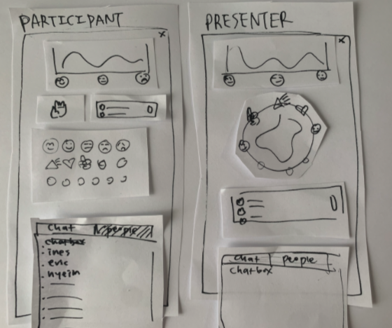
After this session, we settled on a single column interface which doesn’t incorporate video conferencing tools. We wanted our system to be used by anyone, no matter their choice of video-conferencing platform. From that, we generated many ideas about the style and format of the interface, namely where key features like raising hand or emoting would go. Here are the ideas we came up with:
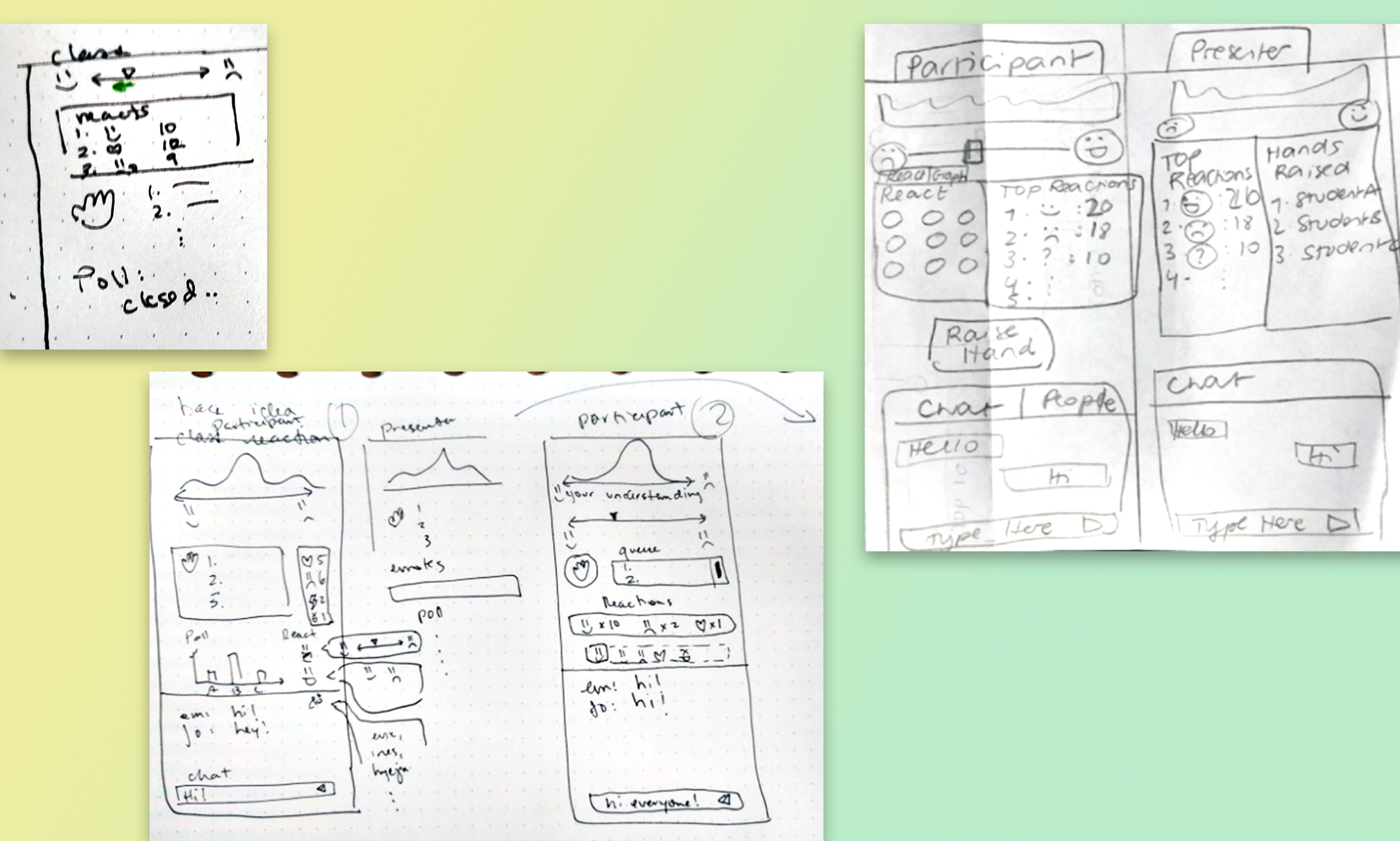
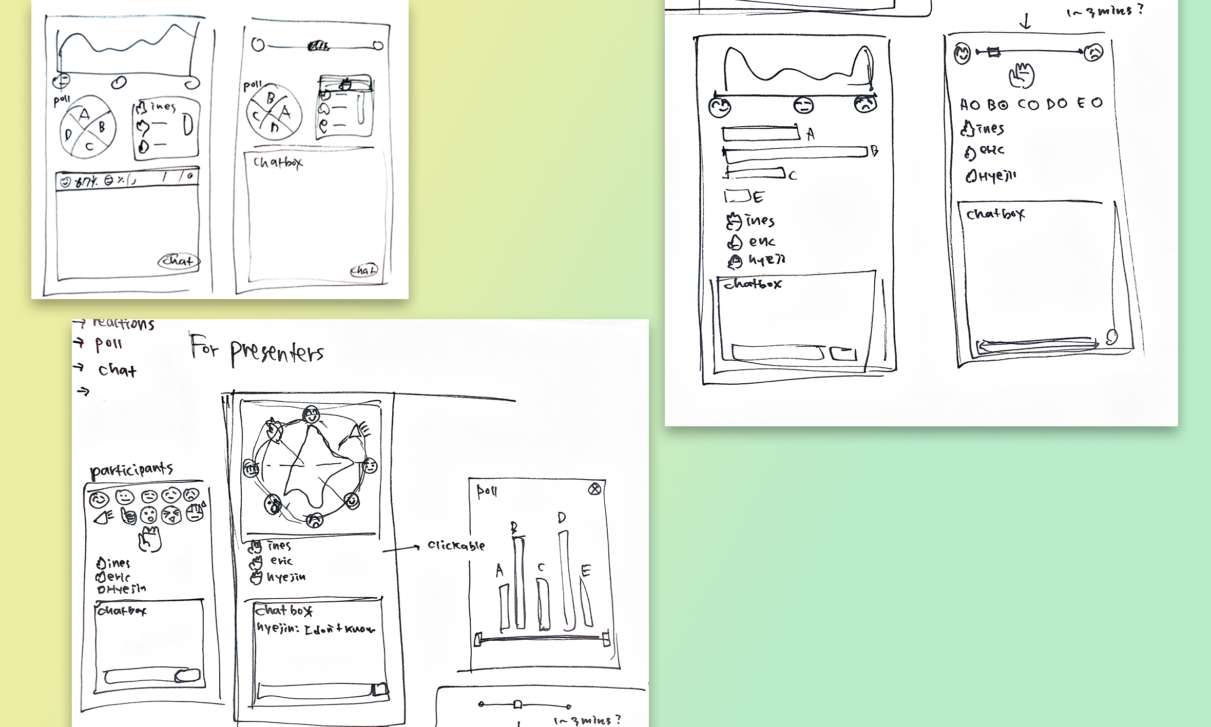
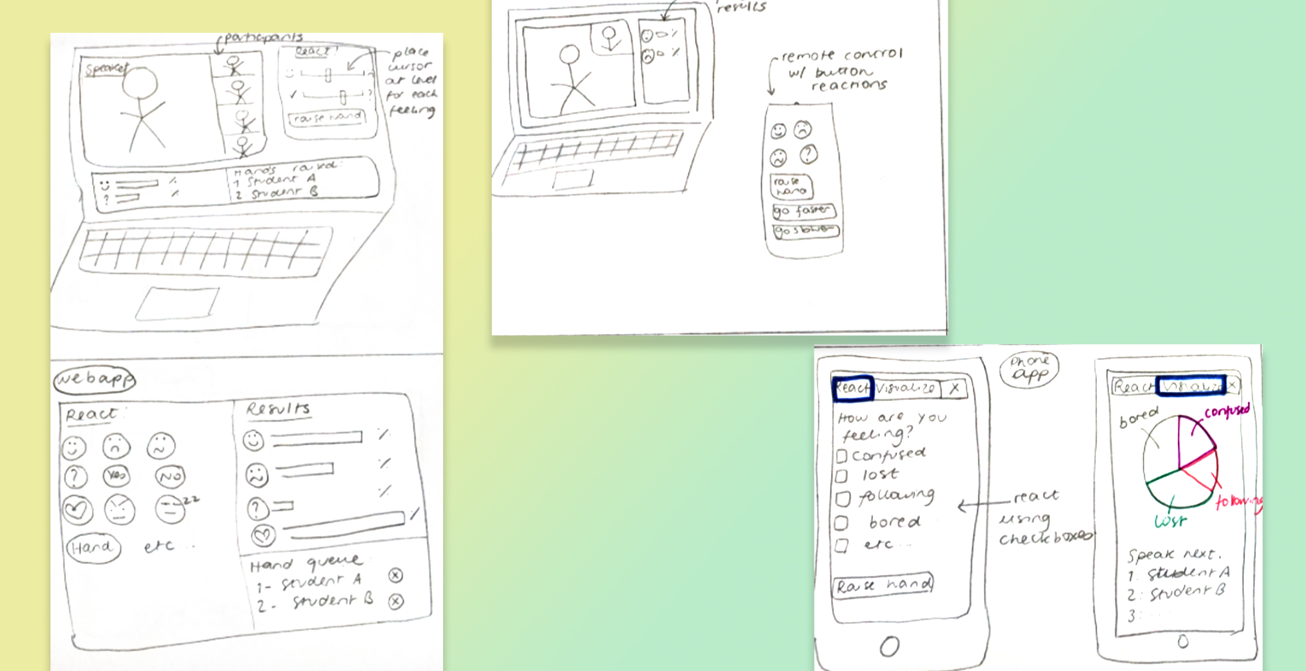
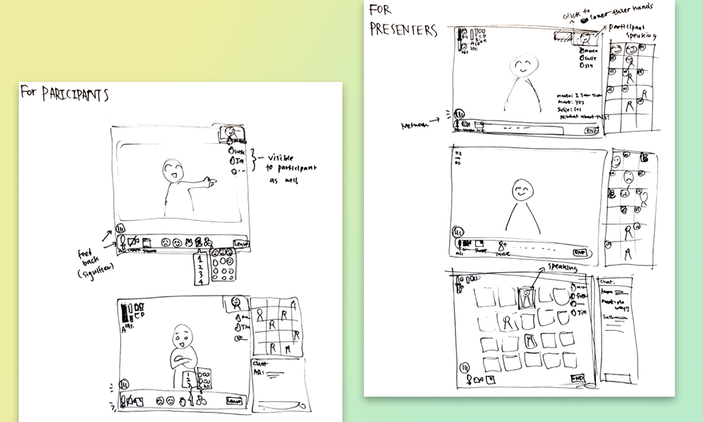
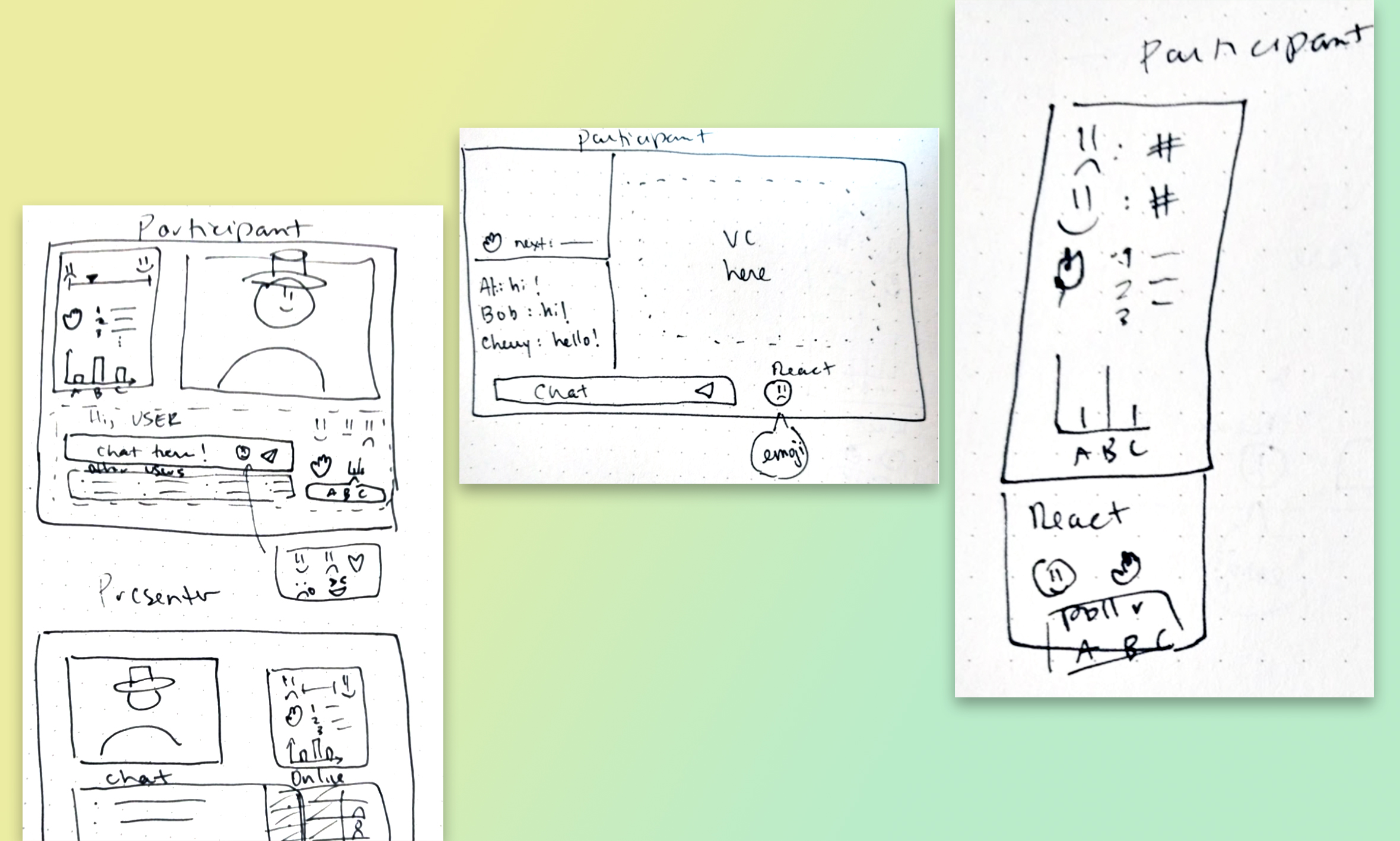
2. Prototypes
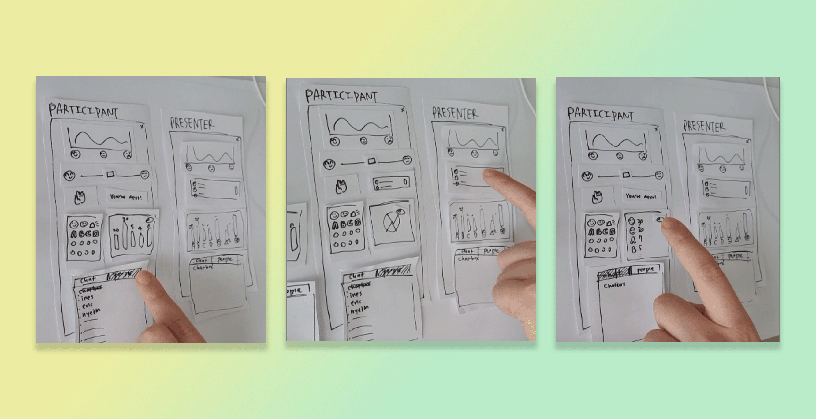
Here are the three initial prototypes we landed on. The only changes at this point was the layout of the features and panels in our program.
Prototype A
Prototype B
Prototype C
We bounced our ideas off each other with sketches and conducted
usability testing with our paper prototypes. For the usability
testing, we ran the wizard of Oz testing as below:
Design decisions
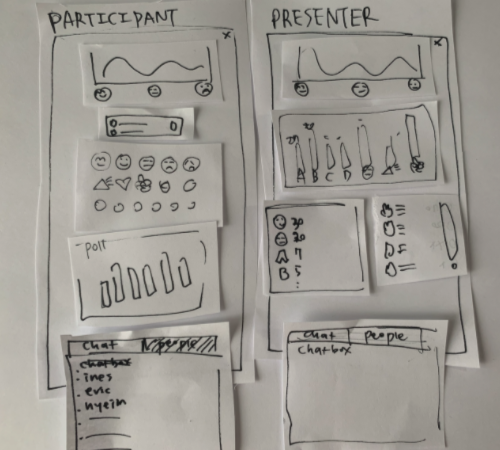
Having worked on our sketches and prototypes, we made several design decisions.-
Not to incorporate videoconferencing in our website.
- In order to make our system accessible to everyone, we decided not to integrate it into any existing video-conferencing platform. Rather, we opted to create a stand-alone web app that can be opened in a separate window and positioned next to the video conferencing software. That way, our system can be used by anyone, no matter their choice of video-conferencing platform. This will also help us in terms of feasibility as we will not have to deal with complicated code bases and integrating our features with existing platforms like Zoom.
-
Vertical display
- We chose a vertical display as it is easy to organize our features from top to bottom while sharing the screen real estate with a video conferencing software. This also facilitates displaying on tablets or phones if users decide to use those instead of having two different windows open.
-
Integrate chat feature
- At first, we were debating whether we should create a chat feature in our app, or rely on the user video conferencing platform’s chat feature. We ultimately decided to add a chat feature to our application. Having chat functionality in our app means that users don’t need to continually go back to the video conferencing software they use. Having a chat feature rounds out our application and provides more of a “one stop” app that meets more use cases.
-
Toggle display for aggregate emoji reacts
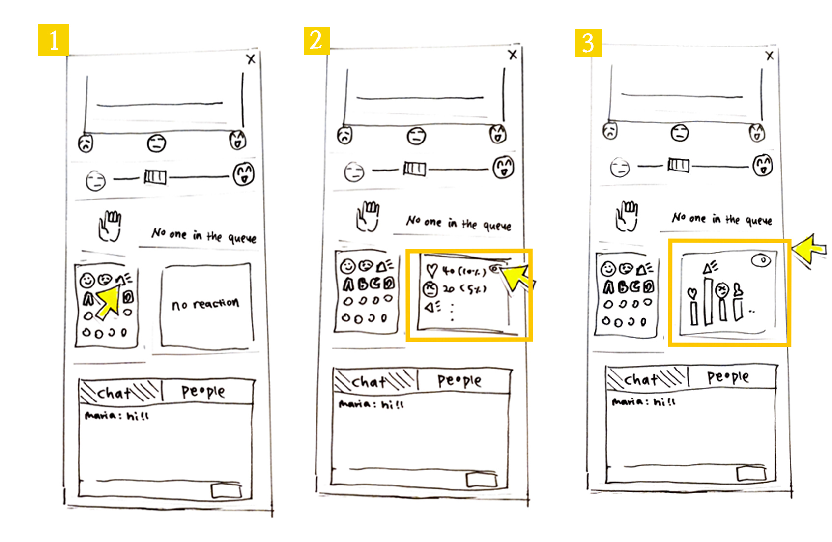
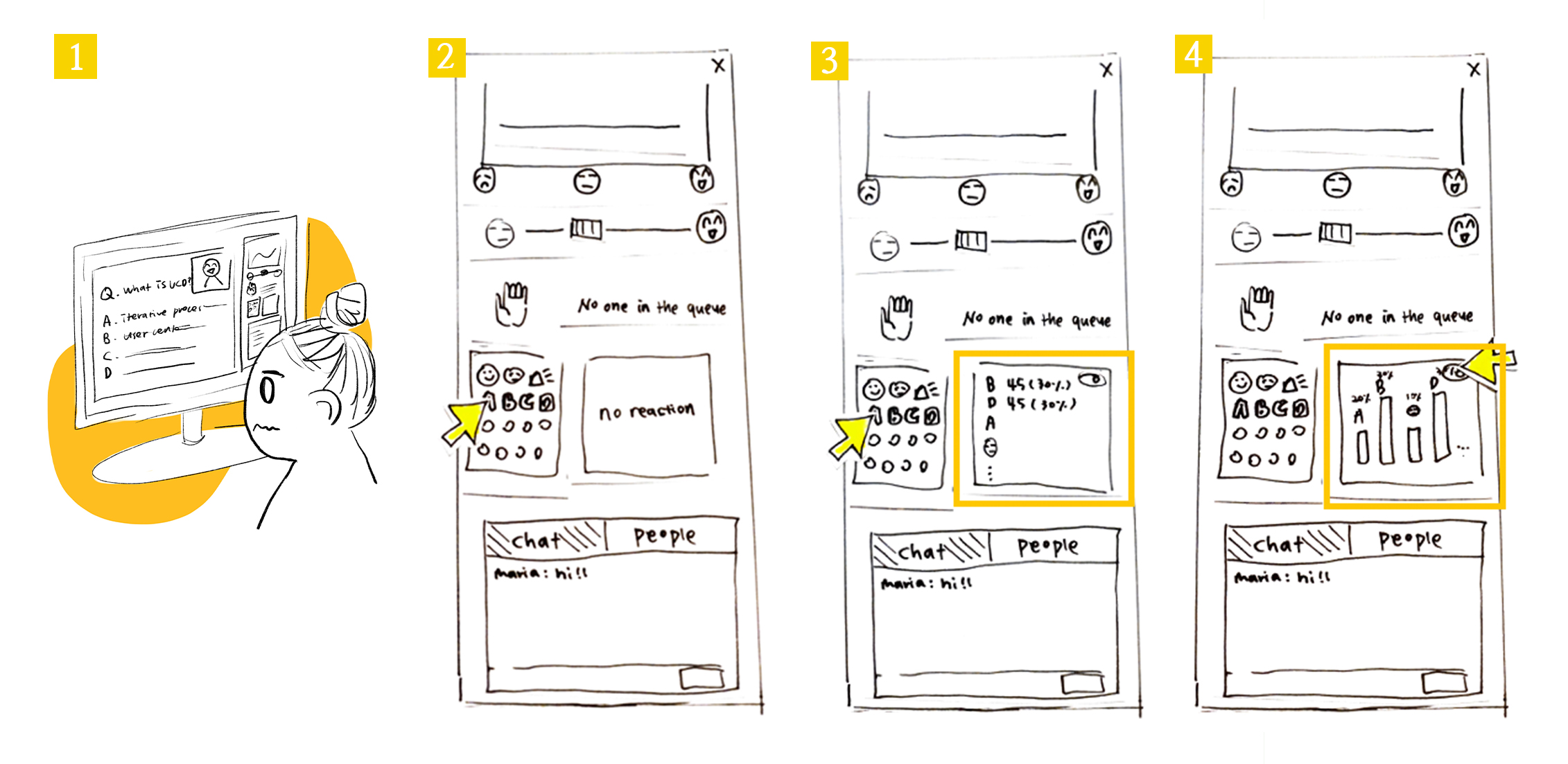
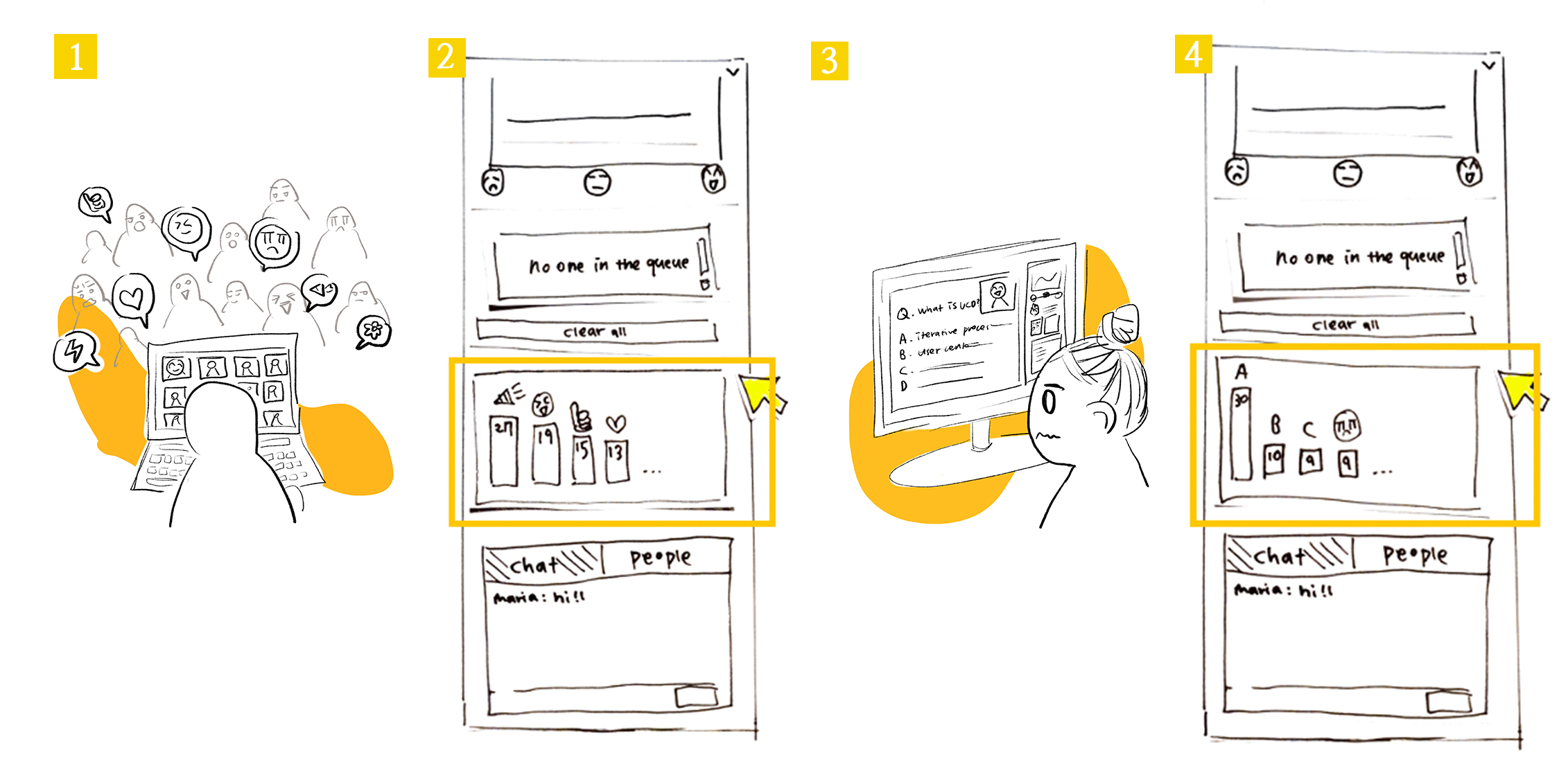
- We were unsure if we should show aggregated emoji responses as a raw number beside the respective emoji, or as a bar graph histogram of emoji responses. Instead of choosing between these two views, we decided to give users the option to toggle between both views (number score and bar graph). This way users can adjust the display of the app in a way that works best for them.
-
Express participant level of understanding on a 2D line +
visualize it in a distribution
- When it comes to the “level of understanding” feature that aggregates how participants self report their understanding of the presentation content, we chose to have users input their level of understanding as a point on a spectrum and display the class aggregate as a distribution. For participants, articulating their understanding on a spectrum opposed to discrete emoji allows for more precise expression on the part of the participant. Displaying the aggregated level of understanding, we opted for a distribution as this will make it easier for the presenter to draw conclusions from the data, as he will be able to see in real-time how the ‘level of understanding’ trend for the audience moves when they make further explanations or present new topics.
-
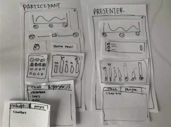
Display participant position in questions queue
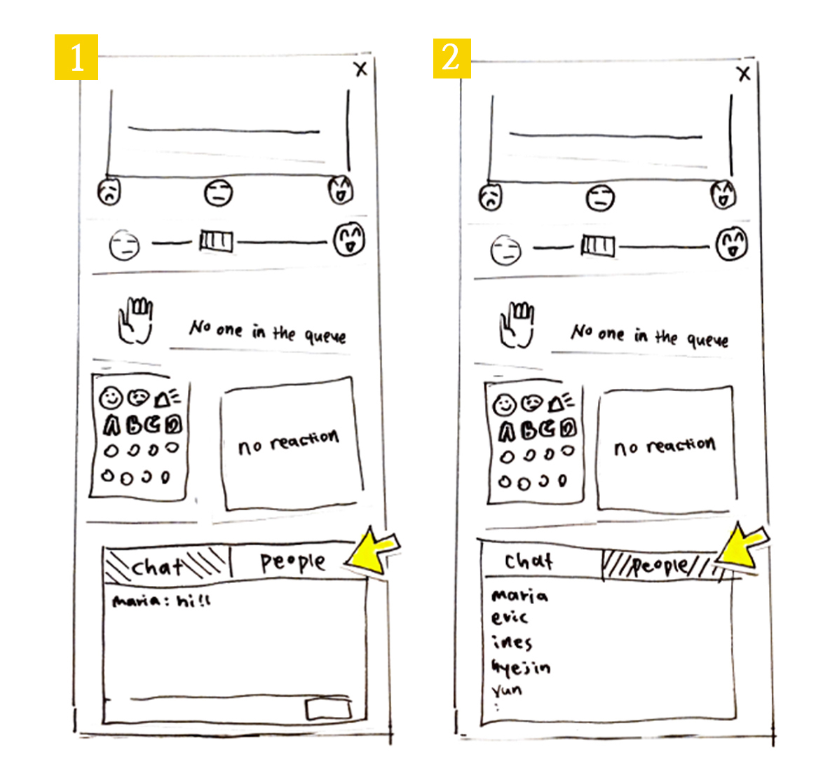
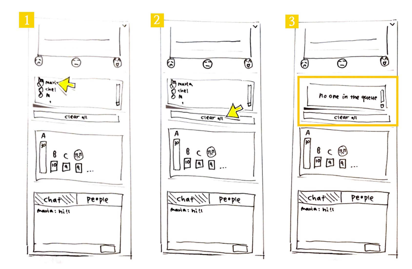
- Regarding the “hand raising” queue populated by participants raising their hand, we chose to not show participants the names of the other participants in the queue. Instead, we decided to simply display the number of participants with their hand up, and if the participant raised their hand, what position they are in the queue. We did this to declutter the UI. We thought the position in the queue would be helpful as students can anticipate when they will be called on to ask their question to the presenter and provide a fair (first come, first serve) order to questions.
-
Polling with emoji
- Most polling features in video conferencing software opens a new popup window. We decided to have an integrated poll feature embedded directly in the interface. We chose this because our observation findings showed us pop up windows can be distracting and annoying to users.
- We also decided to reuse the “reactions” panel that displays popular participant reactions to display polling answers. This means students vote with an emoji (ex 🅰, 🅱) and class aggregates are displayed in the reactions panel. This is better than a dedicated polling panel for two reasons: it saves space, and allows participants to express “I don’t know” or “thinking” emojis while answering. These latter emoji reactions are particularly valuable to a presenter.
Working flow for participants
Express "“I don’t understand”
Participants want to speak
Emote reactions
See other participant’s reactions and answer poll questions
See the participant list
Working flow for Presenters
Ask multiple-choice question to participants and view polling results
Notice the rasied hands and lower them
Check to see if participants are following along
Emote reactions
See other participant’s reactions and answer poll questions
See the participant list
Working flow for Presenters
Ask multiple-choice question to participants and view polling results
Notice the rasied hands and lower them
Check to see if participants are following along
See the participant list
Working flow for Presenters
Ask multiple-choice question to participants and view polling results
Notice the rasied hands and lower them
Check to see if participants are following along
Notice the rasied hands and lower them
Check to see if participants are following along
3. Usability goals & benchmark tasks
Usability Goals
- Learnability: the system should be easily learned by new users
- Rationale: We want our system to be accessible to anyone using videoconferencing softwares, so users should be able to understand the functionalities offered within minutes of using it.
- Ease of use: the system should be easy to interact with
- Rationale: One of the main drawbacks of current video-conferencing tools like Zoom is that they provide an extensive range of features (raising hands, emoji reactions, polling, chat) but they are buried behind different menus and are hard to visualize at the same time (need of switching between windows/layouts…). We aim to offer a system where all interactions can be made in real time and without the need of switching to different windows/apps.
- Efficiency: Software is not distracting and supports live emotional expression
Users should be able to react in real-time and view trends with minimal disruptions to focus.- Rationale: Our system is aimed to be used during presentations so it must not be overly disruptive or distracting to the presenter and/or participants. It should also provide support for students to express their emotional state in real-time with a variety of features without disrupting the presentation. If features are hard to access, users waste their time and can lose focus on the presentation.
- Effectiveness: Software increases engagement
The user should feel more comfortable to express themselves and feel more a part of the presentation.- Rationale: Users can emote and see the class aggregate emotes while remaining anonymous. This will help students (especially shy or anxious students) a less stressful way to engage in the class. This kind of emotional investment helps support participant engagement and overall investment in the presentation.
- Satisfaction: Users should be satisfied when using the system.
- Rationale: The goal of this project is to improve existing video-conferencing. Users should be satisfied with the system and feel it as a valuable add-on to the existing video-conferencing tools.
Please note that the last usability goals will be assessed in the post-test questionnaire.
The benchmark tasks
Tasks for the participant
| Task | Related Usability goals |
|---|---|
| Let the presenter know you’re following | 1,2,3,4 |
| Send a message in the chat | 1,2,4 |
| Add yourself to the question queue | 1,2,3,4 |
| Remove yourself from the question queue | 1,2,3 |
| Answer to polling question | 1,2,3,4 |
| View polling results on bar chart | 1,2,3 |
| Check which students are connected | 1,2 |
| Give the presenter a love-reaction | 1,2,3,4 |
Tasks for the presenter
| Task | Related Usability goals |
|---|---|
| Assess how students are following along | 1,2,3,4 |
| Check which reaction has the highest count | 1,2,3,4 |
| Look up who is next in the question queue and delete them from the queue | 1,2,3 |
| See multiple choice answers | 1,2,3 |
4. Test Materials
- Observer briefing
- User Introduction
- Preset questionnaire for Presenters
- Preset questionnaire for Participants
- User training documentation for participants
- User training documentation for presenters
- Task descriptions
- Test Script
- Data collection sheet
- Post-test questionnaire for Presenters
- Post-test questionnaire for Participants
5. Summary of Test
As planned, we conducted the wizard of Oz testing with our paper prototypes and recorded all sessions. However, for privacy reasons we had to remove such videos from this publicly available website.
Subject A (Participant)
The ethics consent form
Subject A is a student at HEC. She works at Desjardins and uses video conferencing daily for her work and school. She feels comfortable using video conferencing tools and participates in her online class during lectures when asked to.
| Task | Reached? | Time taken | Observations |
|---|---|---|---|
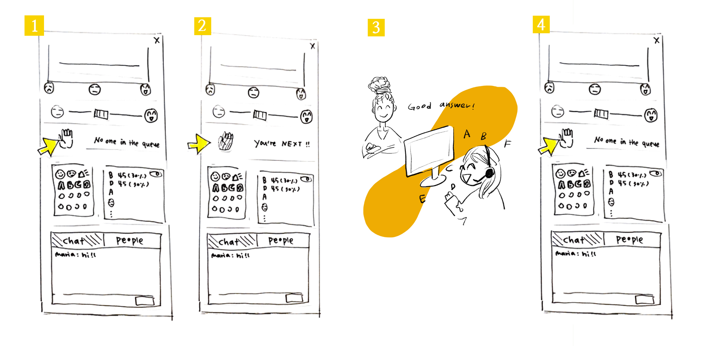
| Let presenter know you’re following | N | 2 secs | Participant used an unintended feature First the participant tried to type the message in a chat box. And then they clicked one of the emojis. The participant did not use the “emotion bar” here. |
| Send a message on the chat | Y | 2 secs | . |
| Add yourself in the question queue | Y | 2 secs | . |
| Remove yourself from the question queue | Y | 2 secs | . |
| Answer the poll | Y | 2 secs | . |
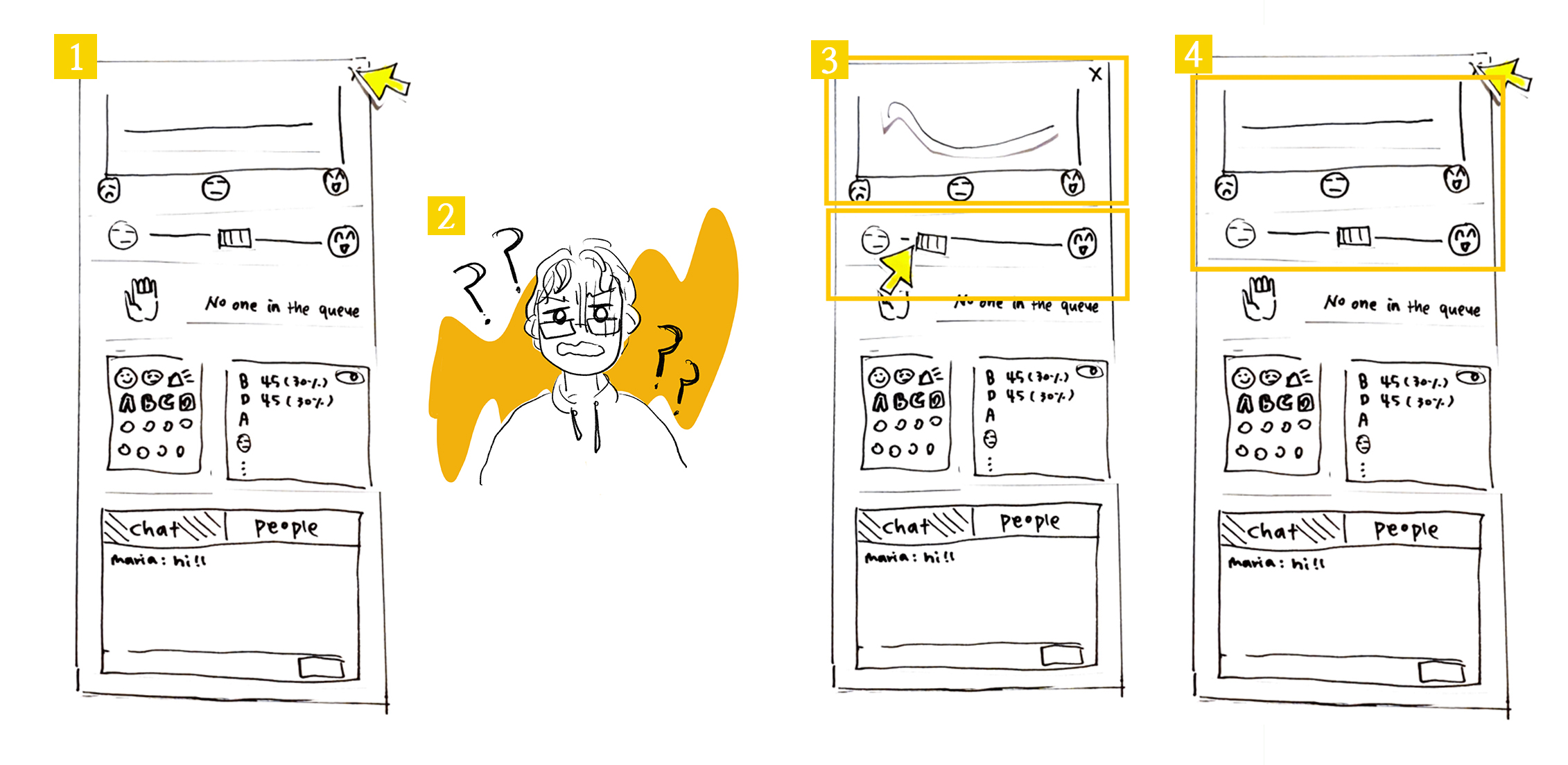
| View the polling result | Y | 2 secs | The participant knew where to check this right away.
However, when asked to check the bar graph version of the results: user paused to think about it (~5sec). She first tried to emote, unsuccessfully, then she noticed the toggle button and clicked on it. When she figured out what that button was doing, it took her 2 secs to switch back and forth between views. She had learned the feature. |
| Check who are connected | N | 10 secs | User got confused, took a long time to reach task
The user spent time looking for the feature. Incorrectly tried to emote first, then tried the chat. The participant seems confused. Finally clicked the “people” button after ten seconds. |
| Emote love emoji | Y | 2 secs | . |
The post test Interview
Are there any additional features you wish Relier had?
“A private chat to talk to my friends”
Were there any parts of the user interface you found confusing?
“At first, I was unsure where to check for the list of participants (looked at the emoji counts, but then found the button next to the chat)”
Any other feedback you'd like to provide us with?
“I think presenters that decide to use this app should let participants know at the beginning of the presentation because some of these features are already present in video-conferencing platforms and it could be confusing for them if people start reacting on both platforms.” “Also, I think the ‘level of understanding’ distribution should reset periodically in order to avoid confusion for the presenter if they clarify a concept and some participants forget to move their cursor back to the middle “
(Note that we already had this in mind, but since we were testing the design on paper this was not shown to the participants)
Subject B (Presenter)
The ethics consent form
The subject B is a developer. He uses the video conferencing software 4 to 6 times a week for work. He delivers a presentation during the code reviews, daily meetings and bug fixing sessions. He is very comfortable using videoconferencing tools. Participants of his presentations engage during the talk only when they have a question. His participants use webcam, voice chat and text chat, but do not raise their hand and or use emotes (ex. “yes” “no” “clap” etc. in Zoom)
| Task | Reached? | Time taken | Observations |
|---|---|---|---|
| Assess how students are following along upon looking at the student understanding graph | N | 10 secs | Graph was initially hard to interpret When the graph was flat, the subject was confused and didn’t seem to know how to interpret it. He intendedly clicked on the emoji to gain more context. Once the graph changed however, he understood how to interpret the graph. |
| Checks the emote with the highest count | Y | 5 secs | . |
| Sees who the next participant is in the question queue | Y | 2 secs | . |
| Remove yourself from the question queue | Y | 2 secs | . |
| Deletes person who just asked a question | N | Never done | We forgot the button in our prototype |
| Ask a multiple choice question and check the answer with the highest count | Y | 2 secs | . |
| Check people who is connected | N | 2 secs | Participant used an unintended feature
User knew that he had to look at the chat but did not click on the ‘People’ button. He suggested that he would send a message on the chat and wait for responses in order to accomplish this task |
The post test Interview
Subject B stated that they would like to see the number of people expressing “the level of understanding”. They like the bar graph of emoji results with numbers displayed. The subject B likes that the distribution of the level of understanding is real-time as they can always check if participants are following their presentation. Overall, it is good that all results are anonymous. The subject believes that this software is especially useful for introverted participants.
Future improvements
A few improvements became clear to us upon the data analysis:
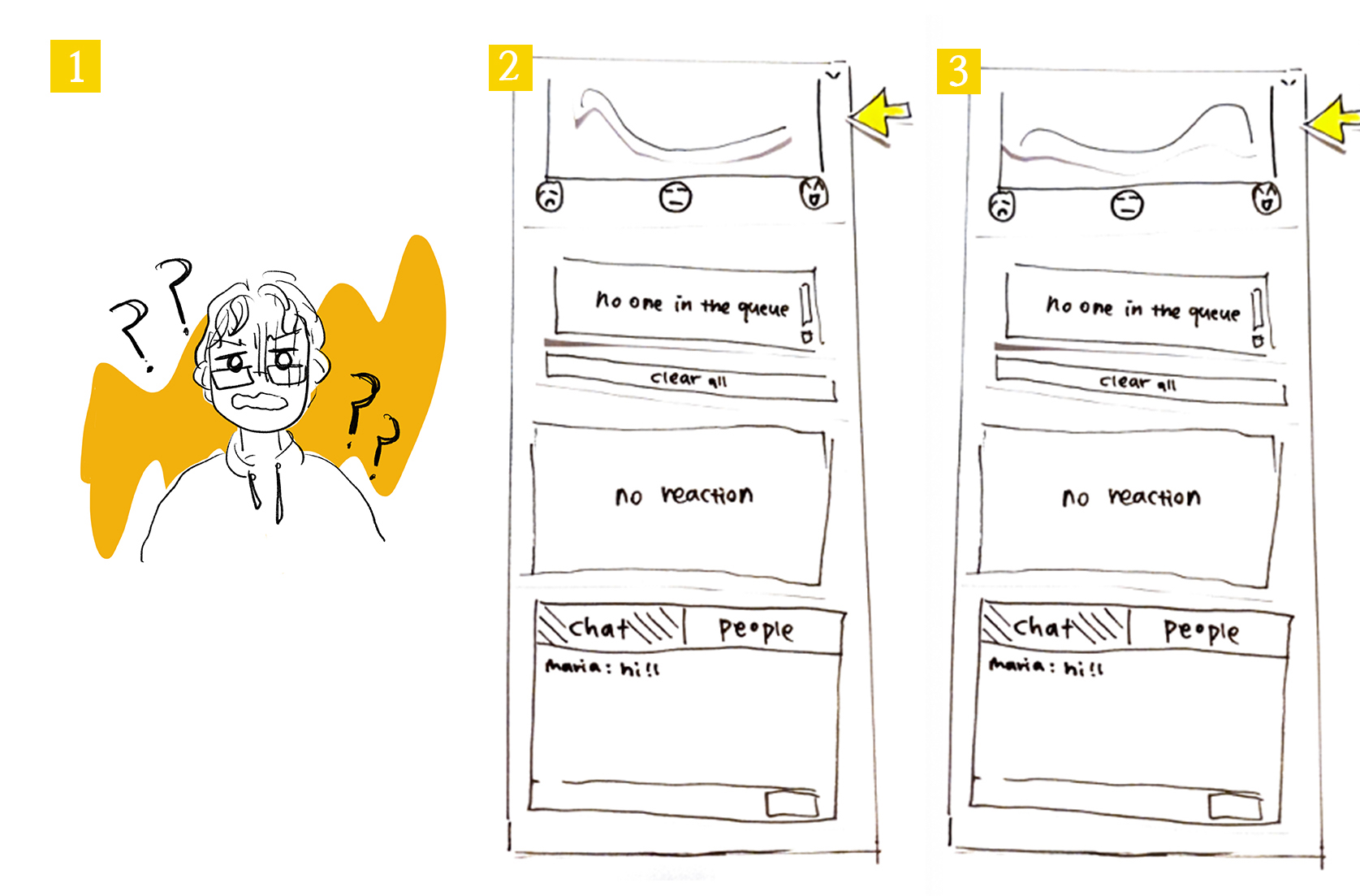
Clearer labelling on level of understanding
Both the participant and presenter had issues initially using and interpreting the level of understanding graph. This is understandable, given the lack of titles, subtitles, and labelling around the graph. To mitigate confusing, we hope to include a title, x and y axis labels, and other text around the graph.
Clearer labelling of buttons
Another source of confusion for both our participant and presenter was the inability to find the toggle to display which users are online. We believe we can fix this issue by making the button to see online clearer, by changing its name from “People” to “Who’s online”.
Clear queue button
One of the issues we encountered was an oversight. In our prototypes, we forgot to include the “clear queue” button and X beside the names of participants in the queue to remove them. We will add those buttons in our next prototype.
Potential quick tutorial upon first use of the app?
One idea that we are considering is including an overlay tutorial upon opening the website for the first time. This tutorial would be no more than three frames that highlight one feature at a time and provide a short description of what it is (ex. Highlight the emoji panel and include the text “Emote here and see other’s emotes!”).
Private chat
As one of our users requested, we would like to add a private chat feature where users have the choice to send a message to all other users or to one in particular. We liked this idea because we hope it will help shy and introverted users more comfort in participating by, for instance, asking the presenter a question.